LaunchBar and User Experience
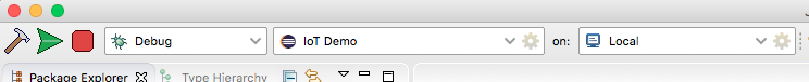
In an effort to make the LaunchBar more “Eclipse standard”, I am trying to make the icons for the build, launch, and stop buttons 24 pixels square. They were 32, which I do admit made the entire tool bar a little too fat. 24 pixel high makes it much more streamlined and you barely notice that it’s still a couple of pixels higher than without the launch bar. I think users can live with that. And I’ll find out soon enough as I always do.
Now, the icons I have there now are ugly. My claim to fame is writing parsers and build systems, not graphic design. I just whipped these together to show what they could look like and get a feel on how the new size helps with the overall visual. We’ll get someone (and Tony McCrary has volunteered) to make them more professional looking.
But I still get the argument from a few people that the UX is bad because the Launch Bar doesn’t look like the rest of the toolbar. Well, no, it doesn’t. And it wasn’t meant to. I think I need to tell the story of how the Launch Bar came about to help explain why.
It started when we were working on BlackBerry Momentics, the IDE for BB10. Our manager hooked us up with a manager who worked in our Sweden office. These were designers who worked at the former TAT (The Astonishing Tribe) who were responsible for the beautiful user experience that became the Cascades framework for BB10. They sent over a handful of “developer experience” designers to a workshop in Ottawa and we brainstormed about how we could make Eclipse beautiful, and more important, a great experience especially for developers who were new to BB10 development.
It was an eye opening experience. They were very cautious about our feelings over the Eclipse UX but were very candid about what they thought. And we didn’t really argue. They took special aim at the tool bar and the “ridiculous” 16-bit icons that were supposed to somehow be meaningful to a new user. It leads to an overwhelming feeling that only intimidates these poor people and we really want to make sure they become successful using our tools. The first recommendation they gave us was to turn off all of the tool bar buttons.
Then we took aim at the launch experience. I have to admit we took some inspiration from popular IDEs that we all had experience with. But in the end, isn’t the most important thing you do with an IDE other than type your code in, is launch the thing you’re coding? We felt it deserved a place front and center. So the Ottawa gang put forward the general layout of the Launch Bar and the Swedes provided the icons and the spacing around the whole widget. They made it big on purpose and made the buttons soft so that the user interface wasn’t so intimidating and was easy to understand.
The feedback we got was tremendous. I’ve told this story before, but when our product manager presented the new look at a developers conference, one of the attendees went up to him after and gave him a hug for making his life so much better. That kind of feedback for a tools developer is hard to beat and something we should all strive for.
As we move forward, and we focus on the general QNX developer and bring them more and more of what’s available in the Eclipse ecosystem, we felt it important that we push the Launch Bar upstream and work to enable it for more and more use cases. Of course, when you try to address a larger audience, not all of them are going to appreciate the look and feel of it. It is different than most things on the tool bar. But by design, it was supposed to dominate the tool bar. Remember, there wasn’t supposed to be anything else there. It’s actually the old tool bar icons that don’t fit. When I set up my environment now, I turn off everything I can and it does result in a very clean look.
I appreciate that not everyone is going to like the Launch Bar or find it useful. We are striving to make it an optional feature. But as we work to support different types of targets you can launch on, we’re finding hard to do without the Launch Bar. So we will get lots of haters and, if you work at all in open source or tools in general, it’s just part of the game and something you get used to. You can’t make everyone happy. But on the other hand, you also need to make sure you don’t make everyone sad. And those UX guys we worked with were very sad about the Eclipse UX and I’m just trying to keep their effort to fix things up alive.