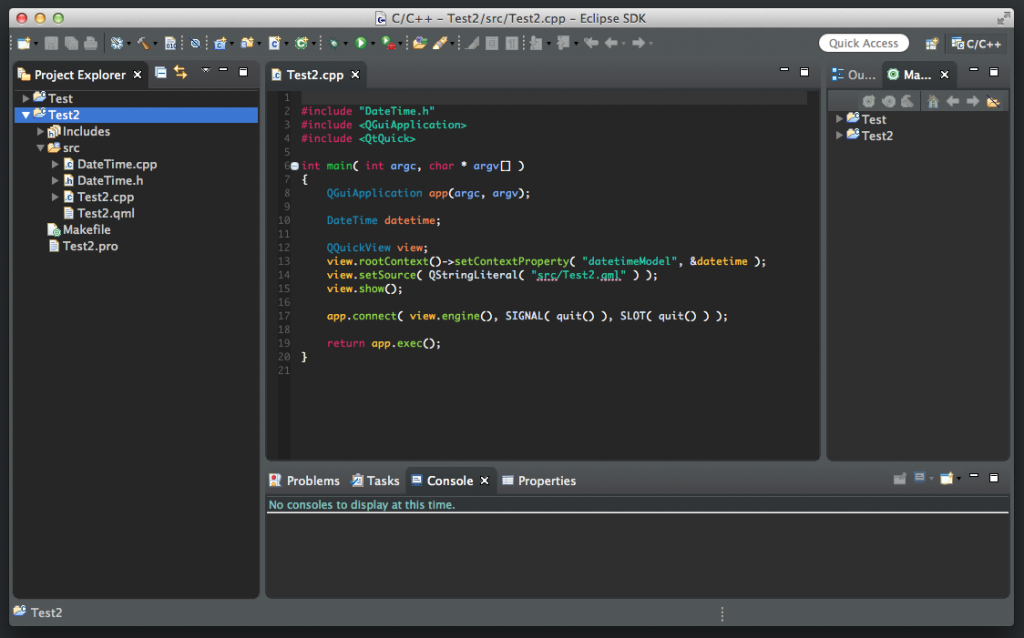
CDT goes Dark - as in Theme
With the helpful push from Lars Vogel, and the great color work from Andrea Guarinoni, CDT now has support for the new dark them coming in Eclipse Luna.
I’ve wondered whether dark was good or not and the UX gang that we worked with at BlackBerry were pretty adamant that it was not a good thing. I’ve also read research that said that dark themes were OK, but not for people with strong astigmatism, such as I. For example, I can never use VGA monitors again since they’re totally blurry to me.
When I turned on the Eclipse dark theme for the first time today, it was everything I feared. But after a while, my eyes adjusted to the scheme and wasn’t bad. I think you have to be really careful how bring or dark you make the text, and some of the editors right now have a little to dark a grey for the text for me to focus on. But In general, I like it a lot. In fact, I switched to my current Momentics environment and felt blinded by all the white. “Once you go dark, it’s hard to go back.” (me on Twitter shortly after that).
There’s still other plug-ins that need to do the same change we’ve done for CDT. JDT, in particular which has a lot of black on black text making it unusable. But once it’s all together, I can’t wait to set it and leave it. And I can’t wait to try it with Momentics. I think embedded developers would love a dark theme. Most of the command line gang I see at QNX are all using dark theme terminal windows. Not that it’s a driver at all, but it might help the IDE feel more natural for them.
For now, here’s a peak at the CDT going dark :).
